Nike Visual Search
Nike Visual Search is a feature within the Nike App that allows users to search for a pair of Nike shoes by taking a picture or using a photo. Visual search is a great tool for users to find shoes that they can't quite put into words by with searching with photographies and images. This helps users compare prices and variation with other similar-styled products to empower users choose the right product for them.
Role:
Interface Design
Experience Design
Time:
2019
Problems
1. While users find Visual Search a useful tool, some may not be using this tool to its maximum capacity, resulting in lower accuracy with the search outcome. The reason being they aren't aware of the best way to position their shoes and crop the photo. This all may cause users to lose confidence in Visual Search.
2. Based on user feedbacks, some users are not even aware of what the feature is. Specifically, they aren't aware that the entry call-to-action is representing visual search. In addition, some users also aren't aware of where to find the feature.
Smart Suggestions
Visual Search will suggest relevant suggestions based on visually similar Nike products. Users can upload a photo or use their cameras to take a picture to search for visually similar products, even if the original product is not from Nike. This helps reduce friction in the consumer product finding journey.
First Time User Guide
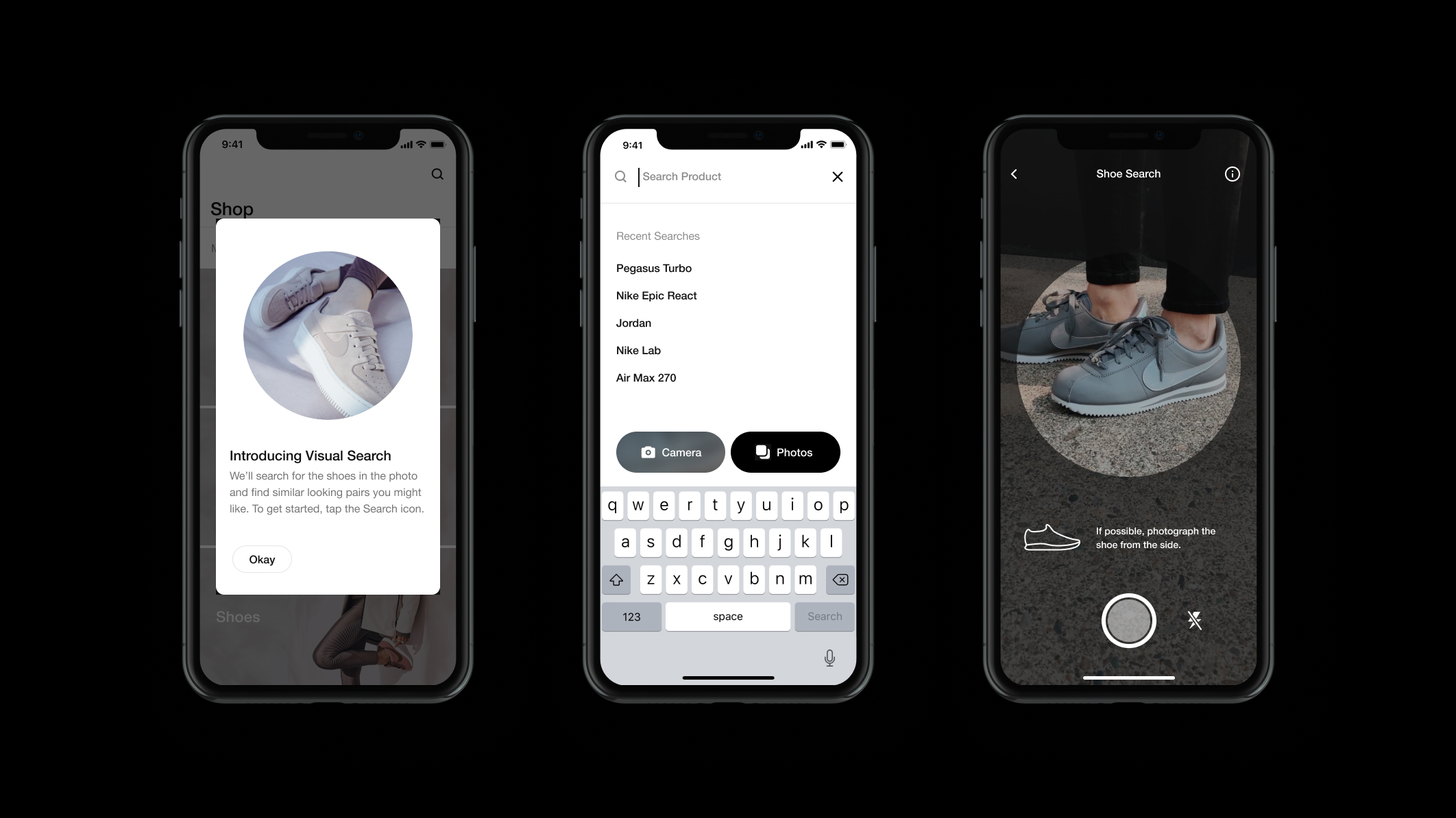
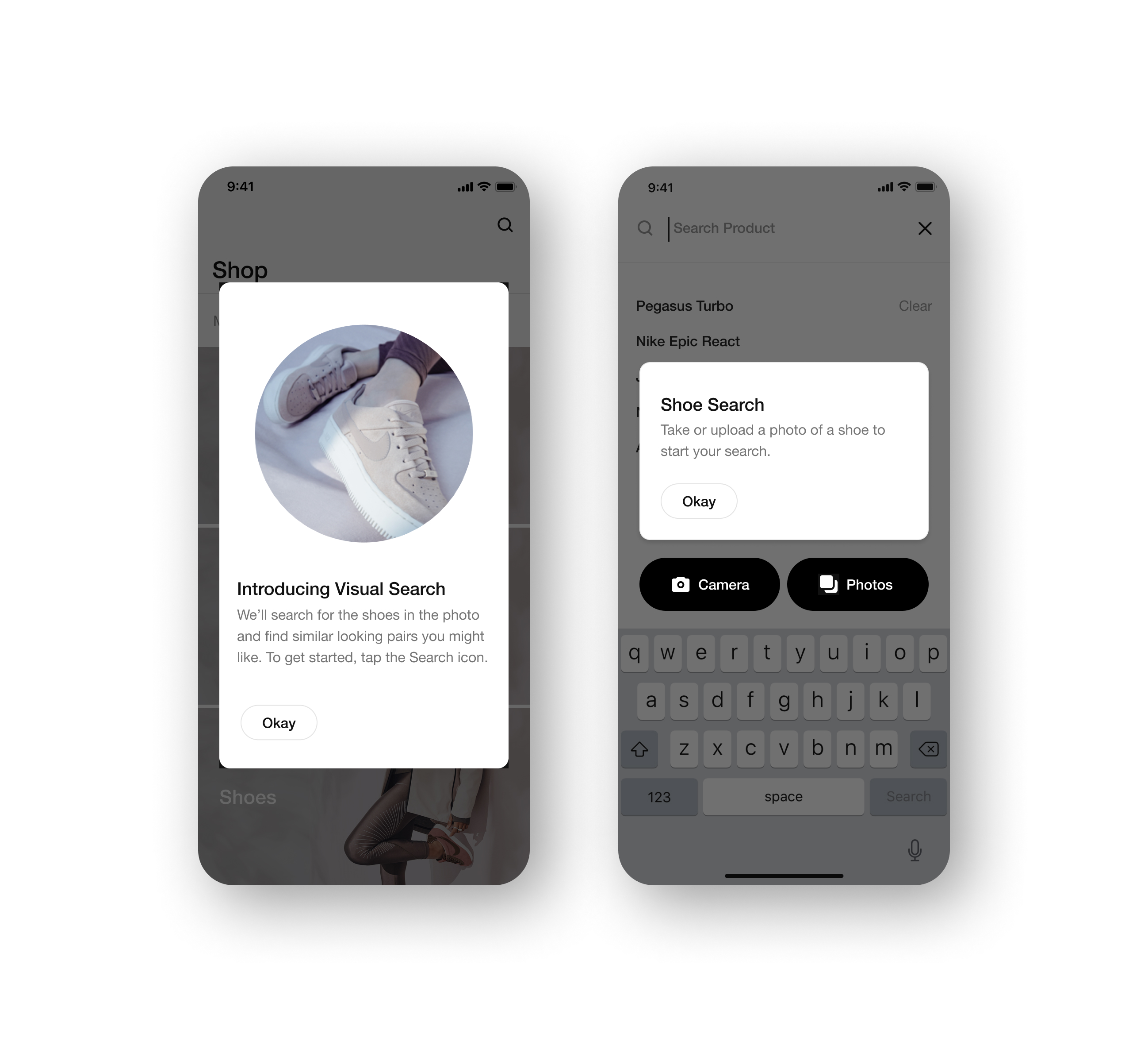
When users first enter the app, they are greeted with a pop-up that introduces visual search and the benefit. They get to experiment a complete new way to search and discover. Once they've entered the search, they will get a help tip pop-up that explains in details the different methods for visual search: using the phone camera, and uploading a photo.
Icon Tool Tips
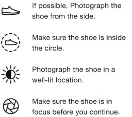
To help users better understand the best way to maximize the visual search results, I've created four different tips for when working with the camera. Each paired with an icon to better visualize what the tip is, so users can have an easier time grasping what they need to do.
⤷ Animated Tool Tips
To help better convey the meaning and message of these tool tips, I've animated these icons for a little more storytelling.
Education Modal
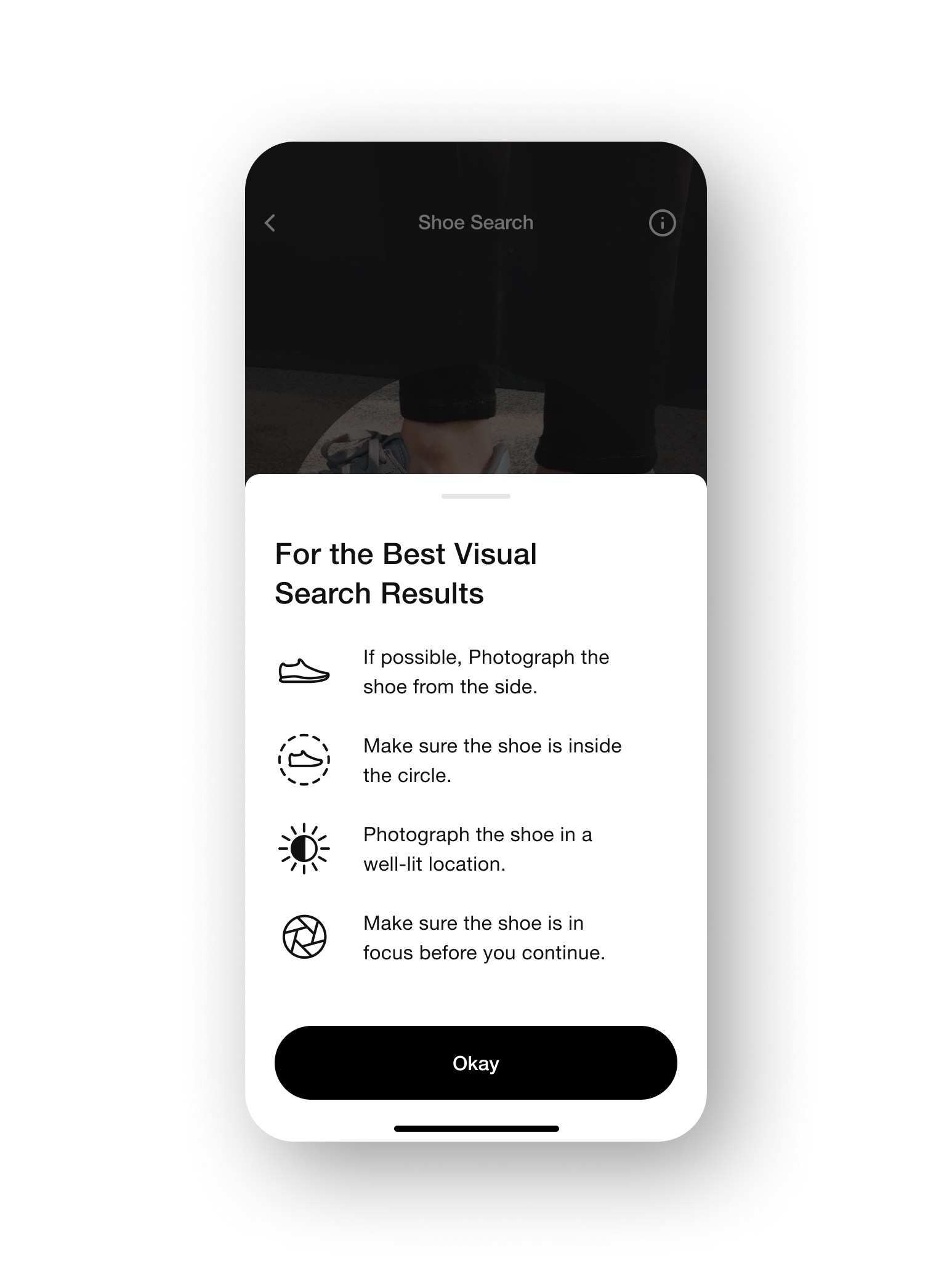
To make sure users can know what to do when photographing their shoes, I designed an education modal that allows users to always access the tool tips anytime. This way they can see all the tips at once in a clear and orderly manner.
Recently Searched Shoes
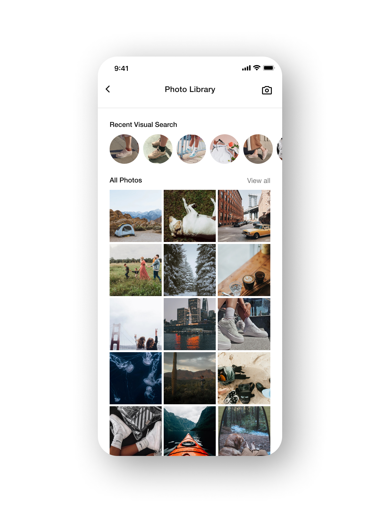
Visual search results can vary from time to time due to the changing of products. To let users easily look up their past searches, they can access their visual search history in the photo library.
User Research Testing
Education Modal
We wanted to know which method of modal that users will prefer between the iconography direction and the photography direction. On one hand, the icon modal provides more overall clarity at a glance, but the photography modal allows users to spend more time with each tips in detail.
In the end, we found users leaning towards the iconography direction because it was more efficient for them. They can easily access it if they've missed the rotating tool tips, while the photography modal took too much effort to navigate and scroll.

Photo Library
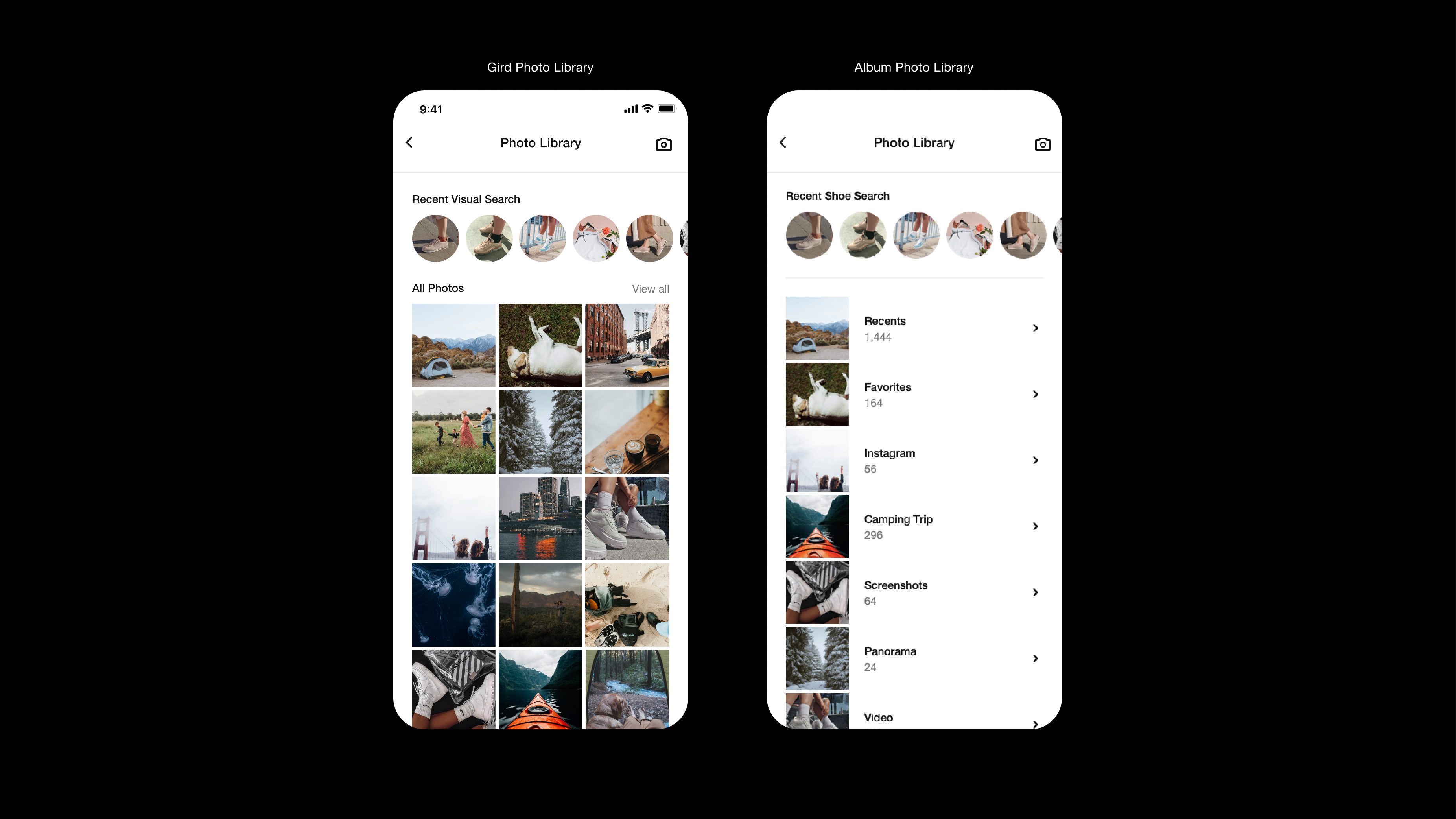
We also wanted to see which method of uploading photos users will prefer. Between selecting their photos through a grid or accessing it in an album view. There are merits to both. One being more convenient for selecting recent photos, while the other is useful if users have albums of shoes saved up.
Users ended up having a mixed results with which photo library they prefer. Some liked the grid view because they can access their photos effortlessly, while on the other hand, some found the album view useful for power users that might have albums of shoes saved somewhere. Ultimately, we ended up going with the grid view because it was more friendly to first-time users.
Takeaway
The best solution isn't the same for every scenario.
While designing for this project, I found that the best design solution all comes down to the use case. When I designed the two different modals, I thought users might prefer the photography modal since it used real-life examples to demonstrate and shows more details. It turns out, that wasn't really the case, because the tips themselves are relatively simple and straightforward. Users didn't feel like they need an in-depth explanation on how to do it. They just wanted to quickly learn it and get back to the experience
Nike Visual Search
Nike Visual Search is a feature within the Nike App that allows users to search for a pair of Nike shoes by taking a picture or using a photo. Visual search is a great tool for users to find shoes that they can't quite put into words by with searching with photographies and images. This helps users compare prices and variation with other similar-styled products to empower users choose the right product for them.
Roles:
User Interface
User Experience
Time:
2019

Problems
1. While users find Visual Search a useful tool, some may not be using this tool to its maximum capacity, resulting in lower accuracy with the search outcome. The reason being users aren't aware of the best way to position their shoes and crop the photo. This all may cause consumers to lose confidence in Visual Search.
2. Based on user feedbacks, some users are not aware of what the feature is. Specifically, they aren't aware that the entry call-to-action is representing visual search. In addition, some users also aren't aware of where to find the feature.
Smart Suggestions
Visual Search will suggest relevant suggestions based on visually similar Nike products. Users can upload a photo or use their cameras to take a picture to search for visually similar products, even if the original product is not from Nike. This helps reduce friction in the consumer product finding journey.
First Time User Guide
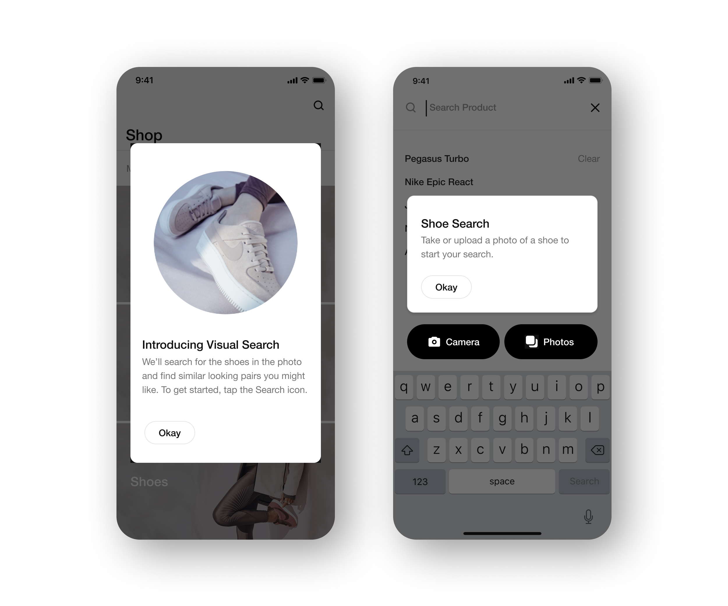
When users first enter the app, they are greeted with a pop-up that introduces visual search and the benefit. They get to experiment a complete new way to search and discover. Once they've entered the search, they will get a help tip pop-up that explains in details the different methods for visual search: using the phone camera, and uploading a photo.

Icon Tool Tips
To help users better understand the best way to maximize the visual search results, I've created four different tips for when working with the camera. Each paired with an icon to better visualize what the tip is, so users can have an easier time grasping what they need to do.
⤷ Animated Tool Tips
To help better convey the meaning and message of these tool tips, I've animated these icons for a little more storytelling.

Education Modal
To make sure users can know what to do when photographing their shoes, I designed an education modal that allows users to always access the tool tips anytime. This way they can see all the tips at once in a clear and orderly manner.

Recently Searched Shoes
Visual search results can vary from time to time due to the changing of products. To let users easily look up their past searches, they can access their visual search history in the photo library.
User Research Testing
Education Modal
We wanted to know which method of modal that users will prefer between the iconography direction and the photography direction. On one hand, the icon modal provides more overall clarity at a glance, but the photography modal allows users to spend more time with each tips in detail.
In the end, we found users leaning towards the iconography direction because it was more efficient for them. They can easily access it if they've missed the rotating tool tips, while the photography modal took too much effort to navigate and scroll.

Photo Library
We also wanted to see which method of uploading photos users will prefer. Between selecting their photos through a grid or accessing it in an album view. There are merits to both. One being more convenient for selecting recent photos, while the other is useful if users have albums of shoes saved up.
Users ended up having a mixed results with which photo library they prefer. Some liked the grid view because they can access their photos effortlessly, while on the other hand, some found the album view useful for power users that might have albums of shoes saved somewhere. Ultimately, we ended up going with the grid view because it was more friendly to first-time users.

Takeaway
The best solution isn't the same for every scenario.
While designing for this project, I found that the best design solution all comes down to the use case. When I designed the two different modals, I thought users might prefer the photography modal since it used real-life examples to demonstrate and shows more details. It turns out, that wasn't really the case, because the tips themselves are relatively simple and straightforward. Users didn't feel like they need an in-depth explanation on how to do it. They just wanted to quickly learn it and get back to the experience
↑
Back to top
Thanks for viewing :D
Index
Interface Design / Experience Design
Interface Design / Experience Design
Interface Design / Experience Design
Identity
Identity / Editorial Print
Identity / Packaging
Last updated 11.30.24
By Sam Yen 🙂
Come say hello!
sam.yen.ch@gmail.com
↑
Back to top
Thanks for viewing :D
Index:
Last updated 11.30.24
By Sam Yen 🙂
Come say hello!
sam.yen.ch@gmail.com